Q&A
How do you make these?
Ink jet printer.
And how do you make the images that you send to the printer?
It's hard to give a short answer to that. I think of it as algorithmically-assisted doodling. Most of the styles/series you see here started out as me doodling with pen and paper. I'm no Daniel Zeller — I have neither the patience nor the drafting skills to produce the large, fancy images I see in my head. So I enlist the computer to help me realize those images physically.
I should probably clarify my first answer. The very large majority of the images I produce do not get printed, but I would not say that they are therefore incomplete or less real. I like looking at them on my screen. Just as pieces of music exist independently of any particular performance, these images exist independently of any particular physical realization.
So you write computer programs, using random number generators operating within complicated, carefully crafted algorithms, to approximate the pictures you see in your mind's eye?
Yes.
Do things always turn out as you planned?
They rarely turn out exactly as planned. Sometimes they turn out better than planned, sometimes they fall short of expectations. It's an interactive and iterative process. I start out trying to produce X. After some initial experimentation I produce Y, which is similar to X but not really the same thing. But Y has its own unanticipated virtues, which are further refined and expanded upon, eventually resulting in Z. It's the Zs that you see here.
How many copies of each image do you print?
Only one. If you buy one, you can comfort yourself with the knowledge that it is unique in the world. I do print multiple similar-yet-distinct images from the same series, though.
How do you choose the colors?
It varies, but usually I use a constrained random walk in color space. The constraints themselves are also usually chosen randomly, though sometimes I specify the constraints myself if I have a particular color region in mind. The downside of working within a large space of color possibilities is that many of the resulting images will have colors I don't like (e.g. green combined with purple — ugh). The upside is that sometimes the programs spit out interesting color combinations that I would not have thought of myself. I typically produce a large number of images, then select some small fraction of them to print.
Could you say some nerdier things about color?
Of course. Color space is curved, like the surface of the earth but 3-dimensional rather than 2-dimensional. Just as wall maps inevitably distort the surface of the earth (making Greenland look bigger than Africa, for example), color coordinate systems, such as RGB, HSL and CMYK, distort color space, stretching some regions and compressing others.
When I'm constructing a random path in color space, I don't want the artificial distortions introduced by color coordinate systems to affect the images I'm generating. L*a*b* color coordinates introduce less distortion than does RGB etc., so I usually work with L*a*b*. Employing the CIEDE2000 color distance formula further reduces distortion.
Some of your images look kind of 3-dimensional. I'm guessing that that is largely unintentional, and that you prefer flatness to illusionistic effects.
Your guess is correct.
Would you characterize these images as "mathematical"?
The answer to that question varies from series to series, but on average the answer is "just a little bit". I actually put a fair amount of effort into making the images look irregular and unpredictable. You might say that I employ slightly sophisticated mathematical techniques in order to make the images look less mathematical.
Would you say that an overarching theme in your work is the interplay between regularity and irregularity, between predictability and randomness?
Yes.
Other themes?
I like for there to be interesting things going on at multiple levels -- micro, macro and, if there's room, meso. Ideally, the images are interesting in one way when viewed close up, and interesting in a completly different way when viewed from far back. I like working on larger images, since that affords more room for multiple structural levels.
Do you sell printed versions of the images?
Yes. Email me at kw@kevinwalker.info.
And you only print one copy of each image, so some images on the web site are not available, but similar ones in the same series will likely be available, correct?
Yes.
It occurs to me that search engines might be eavesdropping on this conversation. Perhaps you should spew out a few words that are directly relevant to this site.
OK, here goes. Abstract. Monoprints. Digital monoprints. Lichen series. Blobs. Colors. Spanning trees. Long hair series. Confined scribbles series. Contemporary (?). Moab. Moab, Utah. Mathematics. Curvy things. Scribbly things. Swirls. Random walks. Random paths. Art. Lichen (again). Abstract (again). Random tilings. Random tesselations. Random walks in color space.
I suspect that you have an older art web site lying around somewhere, out of date and a bit clunky, but nevertheless interesting to more-enthusiastic-than-average viewers. If my suspicions are correct, what's the URL? Don't worry -- if we bury the link here, few people will find it.
Your suspicions are, as usual, correct. The new URL for the older, clunkier site is http://kevinwalker.info/old_site.
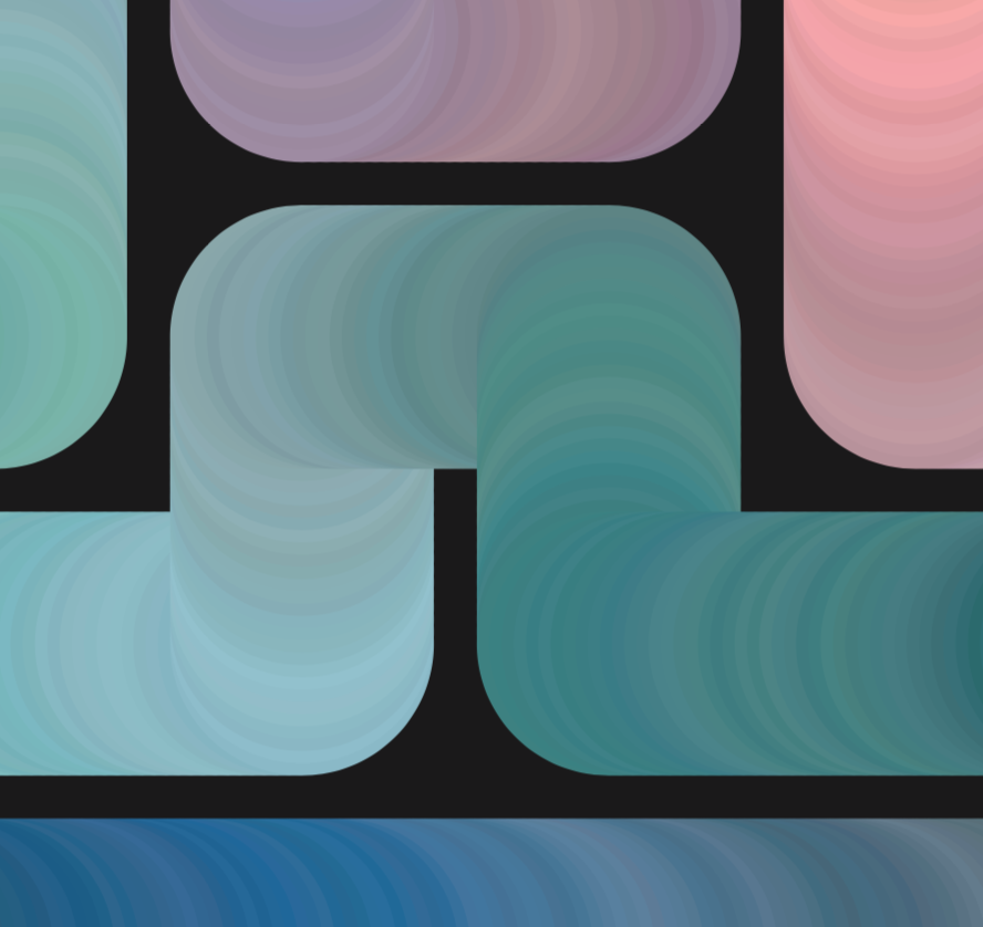
Voro lichen
Voro as in Voronoi cell.
If one wants a random tessellation of the plane, one of the first ideas that comes to mind is sprinkling points
randomly and then taking the corresponding Voronoi cells.
This is what I tried first, and the results were unpleasantly jagged and irregular.
This problem can be partly solved by not allowing the random points to get too close to each other.
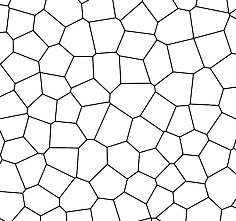 The resulting cells are all roughly the same size, but are still a bit too jagged by my standards.
If one iteratively sets each vertex of the tessellation to the average of its neighboring vertices
(cf. graph Laplacian), the cells gradually
become rounder and less jagged.
The resulting cells are all roughly the same size, but are still a bit too jagged by my standards.
If one iteratively sets each vertex of the tessellation to the average of its neighboring vertices
(cf. graph Laplacian), the cells gradually
become rounder and less jagged.
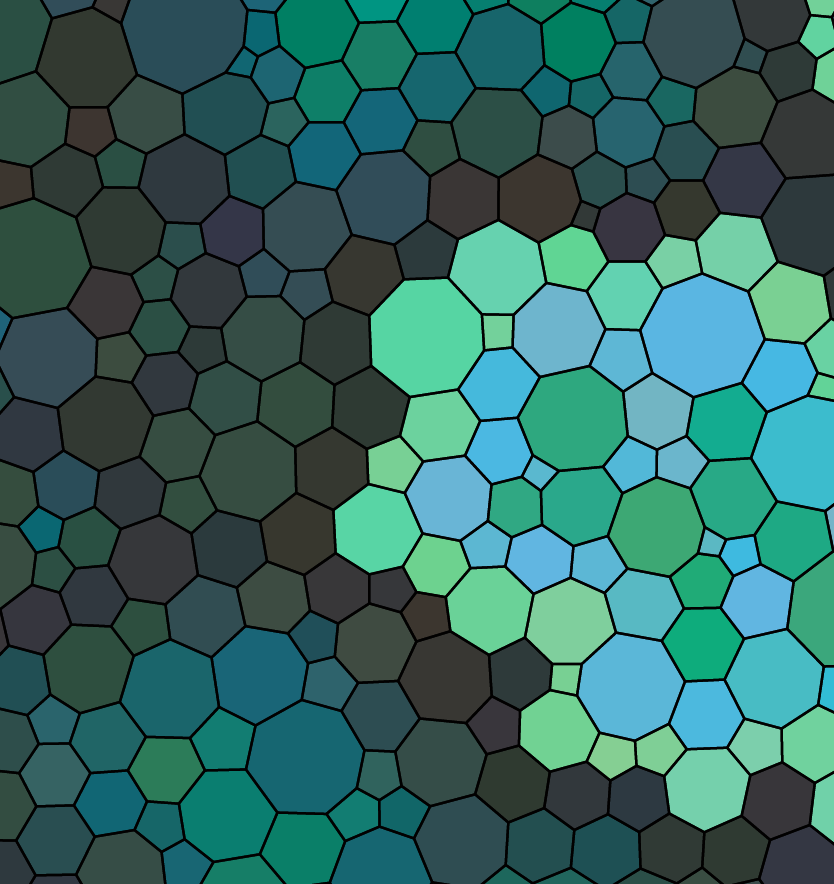 Now that we have a regular-but-not-too-regular tessellation, what to do with it?
Color in the cells like a coloring book.
More specifically, like a coloring book encrusted with lichen.
Now that we have a regular-but-not-too-regular tessellation, what to do with it?
Color in the cells like a coloring book.
More specifically, like a coloring book encrusted with lichen.
Each licheny blob starts with a single seed cell and then grows in concentric rings. The base color of each ring repeats cyclically, with small random variations in each cell. Occasionally a ring will grow a tendril, which affects the shape of subsequent rings.
To add large-scale structure to the image, one can control where seeds are planted or, better, designate areas where certain species of lichen are not allowed to go.
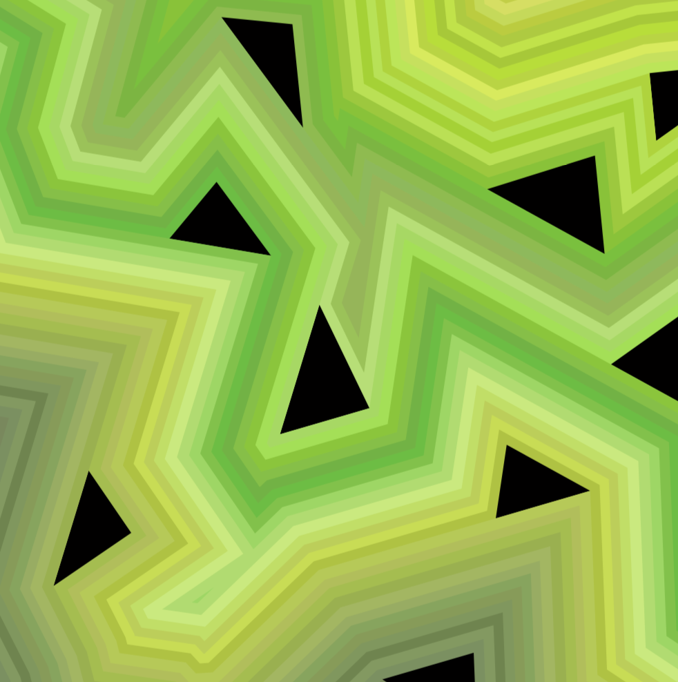
Confined scribbles
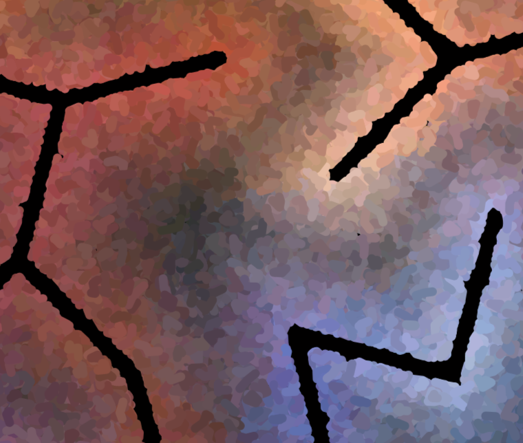 This series started at a gallery in London where I was staring at a Kandinsky painting
and taking note of the (fairly obvious) fact that the interiors of Kandinsky's simple geometric shapes are
sometimes a bit irregular and complicated, with lots of visible brush work and color gradients.
In the natural world, surface colors are almost always like this.
In paintings, a little bit of irregularity comes for free and additional irregularity is not too difficult to achieve.
In computer-based algorithmic art, one must work a bit harder.
This series started at a gallery in London where I was staring at a Kandinsky painting
and taking note of the (fairly obvious) fact that the interiors of Kandinsky's simple geometric shapes are
sometimes a bit irregular and complicated, with lots of visible brush work and color gradients.
In the natural world, surface colors are almost always like this.
In paintings, a little bit of irregularity comes for free and additional irregularity is not too difficult to achieve.
In computer-based algorithmic art, one must work a bit harder.
Start with a semiregular tessellation. (Here "regular" is used in a narrow mathematical sense, different from the common-English sense used elsewhere on this page.) Delete some of the tessellation in order to establish a large-scale pattern. Choose a spanning tree of the remaining portion of the graph. A thickened neighborhood of this tree becomes the area where "paint" is not allowed to go.
The "paint" is just a bunch of short, thick random squiggles. The color of each paint blob is determined by its proximity to the spanning tree and a random color walk along the edges of the tree.
Long hair
The long hair series is a descendant of the short hair series.
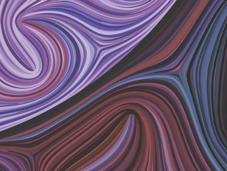 First choose the location of the blobs (if there are to be blobs).
Then choose a random singular line field which is tangent to the blobs.
Finally, draw curves which are tangent to the line field.
(If these curves are replaced by very short line segments, then you would have the short hair series.)
First choose the location of the blobs (if there are to be blobs).
Then choose a random singular line field which is tangent to the blobs.
Finally, draw curves which are tangent to the line field.
(If these curves are replaced by very short line segments, then you would have the short hair series.)
Note "line field" rather than "vector field" above. The resulting singular foliation is nonorientable.
To construct the random line field, first choose (randomly) the locations and types of the singularities, with the constraint that they are not allowed to get too close to each other. Then swap some of the positive and negative singularities, to avoid concentrations of too much positive or too much negative. And, of course, one has to make sure that the Euler characteristic of each region (blobs and complement of all the blobs) comes out right.
Why the animus toward concentrations of like-signed singularities? I don't like the way the hair looks when the positive singularities locally outnumber the negative singularities (or vice versa). But perhaps I should reexamine this prejudice. Maybe my tastes have changed over time.
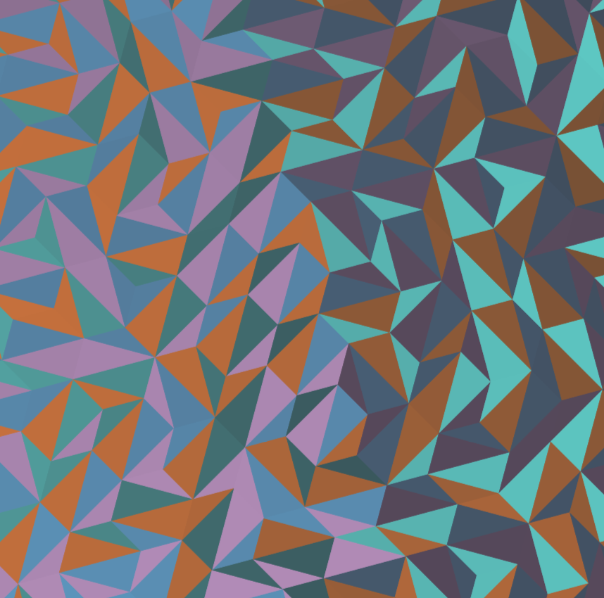
Spanning trees of disks
 The real name of this series is "color tests" — it started with
images intended to test technical aspects of color coordinate system calculations.
But I thought the test images looked kind of spiffy,
so I continued to develop the algorithms and take them in new directions.
The real name of this series is "color tests" — it started with
images intended to test technical aspects of color coordinate system calculations.
But I thought the test images looked kind of spiffy,
so I continued to develop the algorithms and take them in new directions.
All of the images in this series have various things in common. They consist entirely of solid disks of the same radius (excepting the background). The centers of the disks are spaced equally along a spanning tree or spanning forest. The parent graph of the spanning forest is a semi-regular or dual-semi-regular tessellation. The colors of the disks are a constrained random walk in color space, with the constraints sometimes fixed for the entire image and sometimes varying slowing as the random walk evolves.
Layers
Start with some shape and then add concentric polygons. Insert black triangles every now and then in order to make the polygons more interesting. Colors, as usual, follow a constrained random walk.
C-waves
Consider an image composed entirely of various regions, with each region a constant, solid color. If the regions are sufficiently large, we perceive each region-color individually. If the regions are sufficiently small, we perceive an averaged composite color (e.g. alternating red and yellow regions might combine to produce an orange perception; this is how video monitors work). In between the sufficiently large and sufficiently small regimes is an interesting area where we don't perceive an averaged composite color but don't really perceive individual solid-colored regions either. This series was intended to explore that area.
First divide the image into triangles in a slightly irregular fashion. (Knowledgeable viewers might assume at first glance that this is some sort of quasi-periodic tiling, but it's actually simpler than that. I'll leave the actual method of construction of the tiling as mystery for the viewer to solve.) The small triangles are divided into a small number of categories (typically four). Within each category, the color of the triangles varies slowly, in a wave-like fashion, as one moves around the image. (Imagine the wavy surface to the ocean superimposed on the image, and use the wave height to choose the color.) Usually I'm just linearly interpolating between two distant colors. The "waves" for each triangle category are independent, so different parts of the image have different color combinations.
To give the image some large-scale structure, I usually divide it into two regions, with the color-determining wave functions inverted in one of the regions. Consequently, the common boundary of the two regions becomes a curve of high contrast.
| Use icons at the bottom to navigate: | X | |
| next image in series | ||
| previous image in series | ||
| next series | ||
| previous series | ||
| show/hide image caption | ||
| rotate image | ||
| go to random image | ||
| redisplay these helpful hints | ||
| You can also click or swipe on right/left/bottom/top of image to navigate. | ||